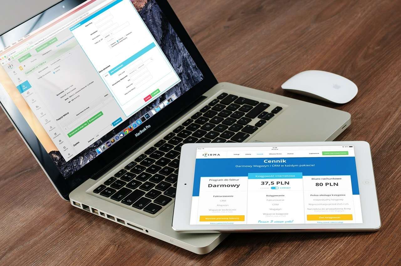
Have you ever wondered how one website has the same display on your tablet, phone, and computer? It is able to fluidly resize because it is a responsive web design. A site designed with responsive web design can adapt its layout to the screen size that it is being projected on through proper development. This development is mainly done through CSS media queries. CSS is the coding that dictates the way a webpage is presented. Another way responsive web design is done is through fluid layouts, which uses sizing in percentages rather than pixels or points.
Why is a Responsive Web Design Important for your Website:
Having a responsive website has become one of the most important components in website development. This is because the use of tablets and mobile web has increased significantly in the last two years. When building a website user experience is key. The ability for a site to adapt to all screen sizes allows for optimal user experience. For example when viewing a site on your phone and then switching to your desktop you never have to worry about seeing a lesser version, or having to search for the desktop URL of this site. That is because with responsive web design regardless of where you are viewing the URL remains the same. It is also important to have a responsive web design for SEO purposes. When you don’t need multiple sites for desktop and mobile you don’t need multiple SEO campaigns.
Site conversions increase greatly when you have responsive web design. When your user doesn’t have to work as hard for what they are doing they are more likely to come back. Having a responsive web design can keep you ahead of your competition because many people don’t believe that it is necessary to have a mobile friendly site. However, what they don’t realize is a lot of traffic starts as mobile and is then converted to web.
Advantages of a Responsive Web Design:
Your sites content and design, as a whole is the same from desktop version to tablet, and mobile. This means there is no need for the user to relearn anything when using the site. The URL for the mobile site and desktop site is the same allowing analytics to be easily tracked, and users to easily access the site from any device. Having the same URL can also be good for SEO because it will still be ranked despite where the traffic is coming from. On a development side there is only one site to maintain as opposed to having a mobile and desktop version. This is also true for a content management perspective.
Examples of Responsive Web Design:
Some big name examples of responsive web designs are sites such as; www.DSLRPros.com. The best way to figure out if a site is responsive or not is to adjust the size of your browser. If the screen doesn’t change at all chances are it is not responsive. However, with DSLRPros the smaller you go the more it changes in order to keep everything on the same screen. Another example is www.mashable.com if you visit this site from your phone rather than having a mobile link it shrinks from its three columns to one column. Allowing mobile and desktop viewers to get the same experience from the same URL.
